we turned 15 this year! read our story here.
how can a 40+ year old company
relate to younger generation?
Thus began our quest for a new identity, giving fresh energy to an organization that has been in existence for over 4+ decades.
The challenge was to create a visual identity that matched the outlook and business context for a company engaged with offering financial products.
The average age of the customer was closer to their sunset years. how can we get younger generation or the next generation children from the existing customers' families to engage with the company?
a new identity is born
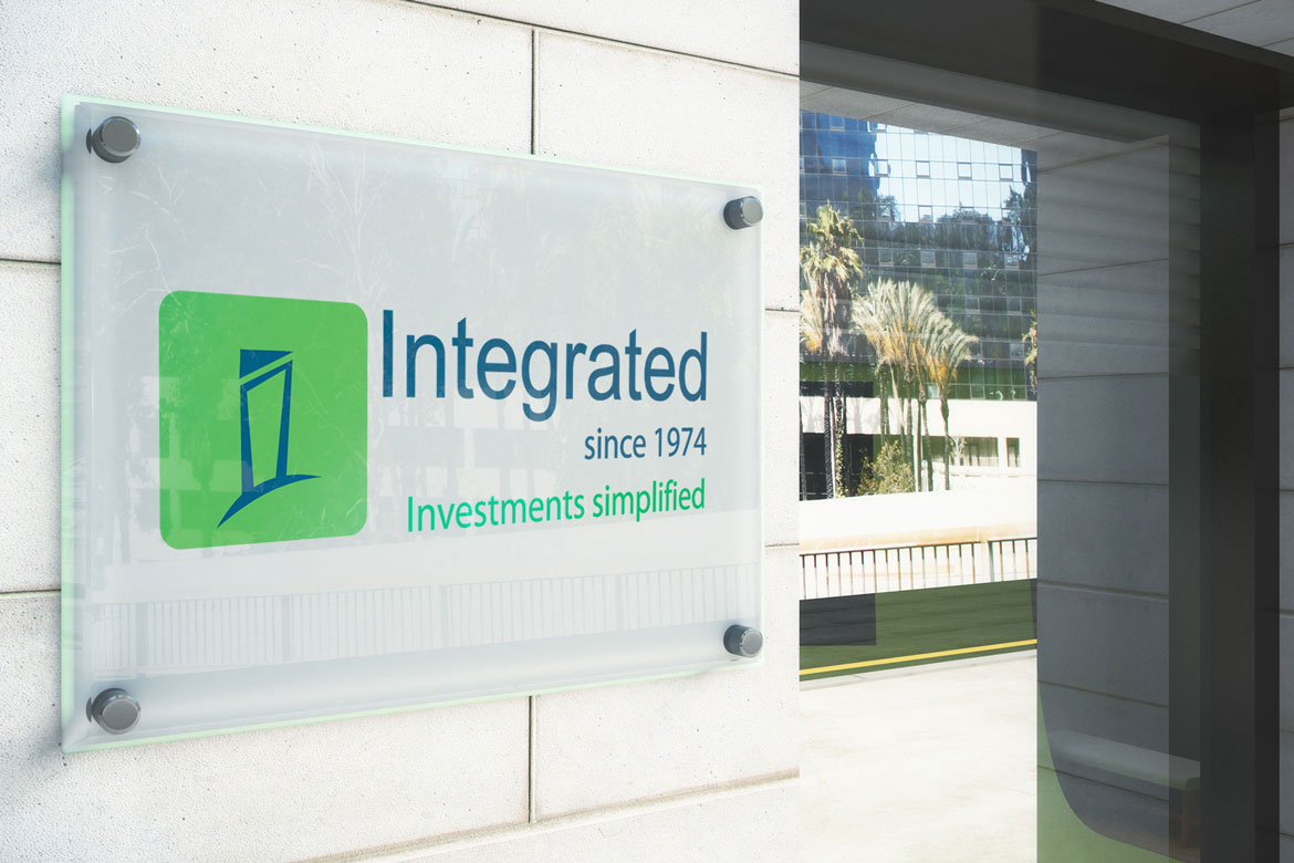
For Integrated, a company with over 45 years in service and millions of customers, and a company that hardly did any advertising, it now needed a fresh bout of energy and a visual identity.
To change Integrated's decades old logo to something relevant and contemporary, we began exploring colors that were relevant to to BFSI industry. blue, as a color, is widely used as a sign of credibitlity and stability. A complementing green was used to signify growth and prosperity which is in alignment with Integrated's offerings.
positioning
A key element of the company was its simplicity and straightforward approach to dealing with its customers and other stakeholders. Hence, the positioning had to reflect this thinking clearly. Signing off on 'investments simplified' was an outcome that came into existence after a lot of deliberations and internal consultations.
Additionally, given its pan-Indian presence, the new identity was made to be neutral across all target age groups and socioeconomic backgrounds.


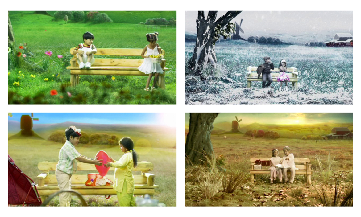
ad film
Furthermore, we also created an ad film to communicate Integrated's new positioning.


let us solve your business challenge