Movie posters and design
This piece brings together two of my favourite worlds – movies and design. More often than not, we are caught in the narrative, the festivity, the stardom, the glamour, the romance, the action and more that we tend to overlook the finer nuances of design that are so meticulously thought out when it comes to movie communication. Back in the day, teasers, teaser glimpses, first single, second single, behind the scenes and more were virtually non-existent. There were only 2 elements that screamed marketing and promotion – a trailer and POSTERS! Posters are the tapestry that adorned the corporation of Chennai. Be it politics, religion, or cinema, posters held a special place in the scheme of things. Unfortunately today, thanks to digitisation, Jio, smartphones, Instagram, Mark Zuckerberg, Sundar Pichai and other unrelated factors, movie posters are no longer the murals that kindle our curiosity, they are merely an action item in an exhaustive list of promotional materials that need to be designed and nine out of ten times, it is released on Twitter or Instagram first and printed very sparsely.
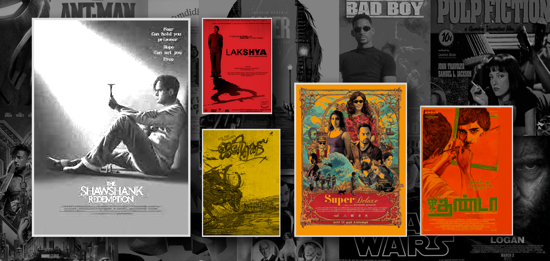
So as an ode to movie posters, here’s celebrating 5 of my favourite movie posters:
- Shawshank Redemption – The movie doesn’t just provide redemption from Shawshank, but from negativity and disdain at large. However, that is a conversation for another day. As far as the poster is concerned, the Shawshank Redemption poster is set in grayscale with an overcast overlay akin to Andy’s time in prison. His time in prison was far from safe, yet, there remained hope, for hope is the best of things and the beam of light hitting Andy from above is the epitome of that emotion.
- Lakshya – Over the last one week or so, I have been obsessing about this movie. I believe it is because it inspires me to overcome the challenges in my path and attain my goal. What is beautiful about the Lakshya poster is the typeface that becomes progressively bolder as we move from L to A symbolising Karan’s journey from a boy to a man forged in the fires of war. Minimalism epitomised.
- Super Deluxe – Complex, bizzare, vivid, confusing, amazing, ‘what the frak was that’, these are a few emotions one goes through while watching this masterpiece from thyagaraja kumararaja. The poster is a perfect ode to that sentiment. A juxtaposition of multiple colours, hand-drawn elements and multiple font styles symbolise the multiple emotional layers the movie unveils as it progresses.
- Jallikattu – Lijo Jose Pellissery takes edgy to a completely different plane altogether with Jallikattu. Chaotic, bloody, violent, loud, rustic, and dark Jallikattu is not for the weak-stomached to sit through. Yet, it captures so many emotions that the urban-dweller cannot even fathom. Interestingly, the poster too, designed with clay/wet mud is as imperfect, rustic, and chaotic as the movie itself. Design is consistency across all mediums and the designer nailed the brief!
- Jigarthanda – The loudest announcement of Karthik Subbaraj’s arrival was Jigarthanda but it was also the emergence of a phenomenon, Assault Sethu. The movie revolves around how Karthik, in an attempt to make a gangster movie in Madurai ends up getting too close to a ruthless gangster Assault Sethu. Interestingly, he is forced to make the movie he set out to make with Assault Sethu as the hero and an ensemble of emotions ensue. The artwork of Jigarthanda is just as flippant as the movie itself in vibrant pink and neon blue. However, the intricacy lies in the unfinished art in each of the posters, it is a testament to how Karthik wasn’t able to complete anything he took up – be it his romantic interest, the movie he wanted to make or the life he wanted to live. The devil is in the details? No. Design is.
What are some of your favourite movies and are their posters interesting too? Comment below!


