citi | lowercase brand #2
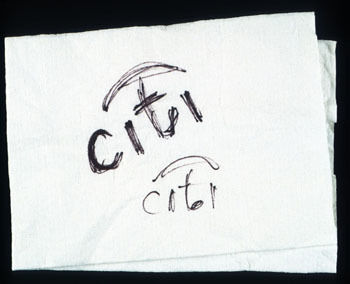
picture this: in a busy new york city, amid bustling scenes, an iconic #redesigning moment unfolded for an old brand on a napkin in 10 minutes. guess the brand? It’s Citi. stick around to unravel the interesting story.
citi wasn’t always known by its sleek lowercase. It was first called the first national city bank recognised as a one-bank holding company, first national city corporation or “Citicorp”. The bank has been nicknamed Citibank since the 1860s.
why and what was the reason for Citibank being called citi with all lowercase? and what is that arc from i to i?
it all started when the citicorp merged with the travellers’ group. the fusion of the umbrella from the traveller’s group and citi name gave birth to the new logo with all lowercase in less than 10 minutes.
now, the takeaways.
- a shift to lowercase aligns with contemporary design trends, reflecting the financial giant’s fascination with staying relevant in the rapidly evolving financial landscape.
- a sense of approachability and informality was brought in, making the brand feel more accessible to a wider audience.
- sometimes, the simple and minimal designs stand out from the crowd and speak for themselves.
hey! here’s the 10-minute hand-drawn logo by paula scher.

let us know what you think of the citi rebranding of the logo in the comments below.


