


asianpaints | lowercase brand #4
does a simple ‘can of paint’ hold the power to narrate tales of love, warmth and individuality? can it breathe life into the walls that are a part of life and silently witness our lives? there is one brand that firmly believes so, and their tagline says it all – ‘Har Ghar Kuch Kehta Hai’, which translates into ‘every home says something’. Asian Paints, the name that colours our world, has not just painted walls but crafted stories.
the captivating focal point here is, asian paints as a brand has always endeavoured to be a part of the people’s family. over the following decades, with the aspirations and direction of growth directed toward the global market, a rebrand was in order. a rebranding not just to appeal to the target of higher business goals but also to remain resolutely the asianpaints we know: a part of our family.
since 1954, the logo has been rebranded just twice. until 2012, the logo had two colours, red and yellow and later, the logo was shortened to ‘ap’.
here are our key observations from the new logo are below
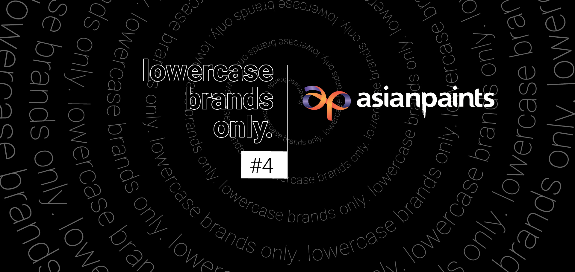
- the logo’s centrepiece is a flowing ribbon that forms the letters ‘a’ and ‘p.’
- the ribbon’s design is meant to highlight the easy flow, smoothness, dynamism and possibility of their solutions and offerings.
- the ribbon features vibrant colours like red, orange, and purple, giving it a modern feel.
- the word ‘asianpaints’ keeps the dripping paint ‘p’ from the old logo, but now it’s in red, not yellow.
- as time passes, brands evolve to stay relevant and appealing across the generations and demographics of customers. the choice of lowercase letters is also a strategy to appeal to a more contemporary audience.
let us know what you all think about asian paints, it’s lowercase below and we shall discuss it!